🔥 The Website Roast Nobody Asked For But Everyone Needed
Big Box Retailers vs. People Who Actually Know What They’re Doing
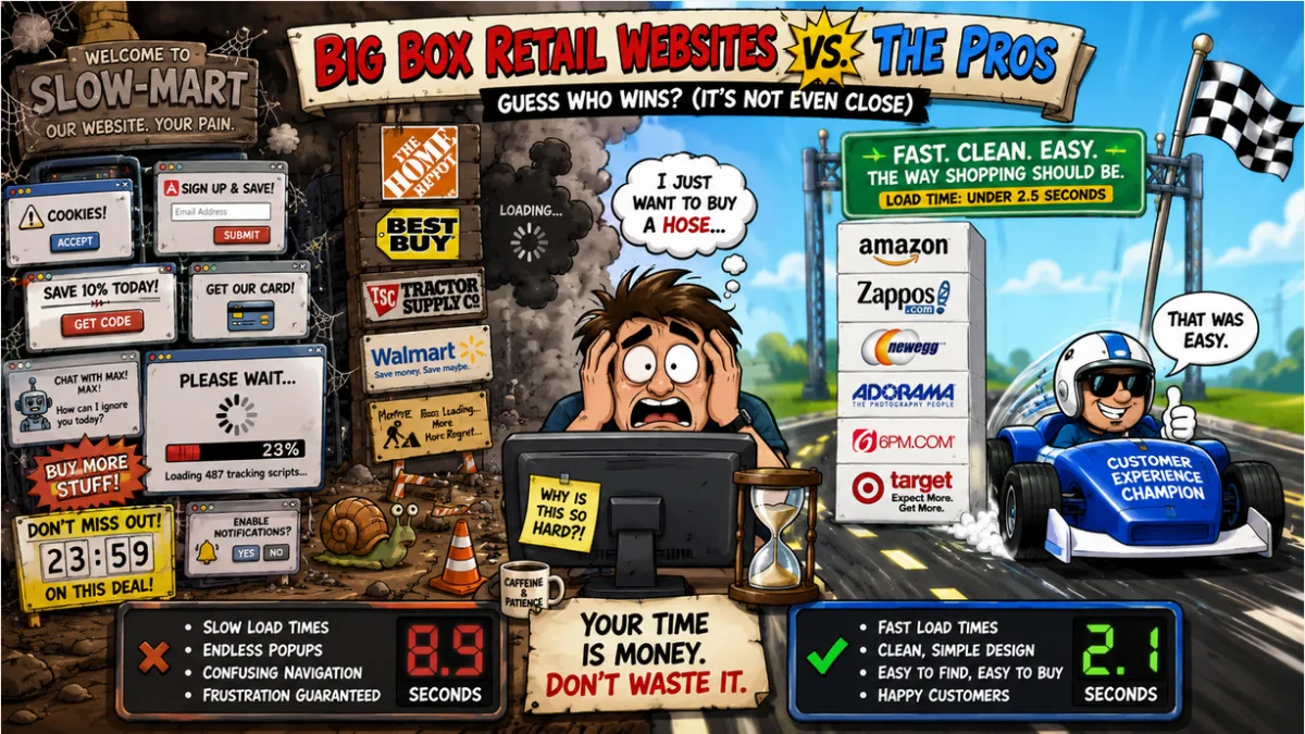
Let’s talk about something that affects millions of Americans every single day: the absolute agony of shopping on big box retailer websites. You have money. You want to give them money. And yet somehow, they’ve made that nearly impossible. This is their roast.
The Accused 🚨
Home Depot — The Loading Screen That Outlived Your Marriage
Estimated load time: ~8.4 seconds
HomeDepot.com loads like it’s pulling a full flatbed of lumber over a dial-up modem. The homepage alone ships more JavaScript than the Apollo Guidance Computer had total memory. You can add a $4,000 riding mower to your cart, question every decision you’ve ever made, repaint your living room, and still be waiting for the filter sidebar to appear.
Their search filters are a particular highlight — select “in-store only,” wait six seconds, watch the page reload, and discover the filter didn’t apply. Try again. Watch it not apply again. Drive to the actual store. That was their plan all along.
Best Buy — Six Popups Before You Can Buy a Cable
Estimated load time: ~7.1 seconds
Best Buy’s site greets you like an overeager floor associate who won’t leave you alone. Cookie banner. Newsletter popup. Geek Squad upsell. Credit card offer. Rewards signup. Then — then — the product you clicked on finally loads, only for a chat widget to launch in the corner like a jumpscare.
Their A/B testing team is clearly A/B testing how many popups cause clinical anxiety. Answer: it’s five. Five is the number.
Tractor Supply — Designed by Someone Who Has Never Used a Website
Estimated load time: ~9.2 seconds
Bless their hearts. Tractor Supply built a site that loads slower than the tractor you’re trying to buy parts for. Their search function returns results with the confidence of a golden retriever who ran into the room and immediately forgot why. Type “chicken feeder” and prepare for the algorithm to offer you a horse blanket, motor oil, and what appears to be a decorative gourd.
The mobile experience deserves its own roast. Buttons that are either too small to tap or so large they take up the entire screen. No in between. It’s a design philosophy, apparently.
Walmart — Slightly Better. A Low Bar. Cleared.
Estimated load time: ~5.3 seconds
Walmart’s website is the participation trophy of e-commerce. Sure, it’s faster than a confused golden retriever (see above), but the product listings read like they were written by someone who lost a bet. “Men Cargo Pant Work Trouser Stretch Military Multi Pocket Slim Fit Khaki 34” — that’s not a product name, that’s keyword stuffing wearing khakis.
The marketplace third-party seller problem is also real: you think you’re buying from Walmart, you’re actually buying from ShenzhenGoodsDirect2U with a 60-day shipping window. Fine print is doing a lot of heavy lifting here. Still: C+. For Walmart, we’ll take it.
Honorable Mentions in the Hall of Shame
- Lowe’s — Home Depot’s slower cousin who also wants you to create an account before you can find out if a 2×4 is in stock at your local store. No. Absolutely not.
- PetSmart.com — Somehow managed to make buying dog food feel like filing your taxes. The navigation has submenus that have submenus. It’s turtles all the way down, but the turtles are also loading.
- Bass Pro Shops — Their website loads as if the servers are located inside an actual bass, underwater, in a lake, in the Ozarks, in 2003.
The Pros — How It’s Actually Done ✅
Amazon — The One That Ruined Everyone Else’s Excuse
Average load time: ~1.8 seconds
Amazon famously calculated that every 100ms of load time costs them 1% in sales — so they optimized accordingly. Every interaction is instantaneous, search actually finds what you typed, and checkout takes fewer clicks than it takes Home Depot to render their navigation menu.
Love them or hate them, Amazon’s engineers have forgotten more about e-commerce performance than Best Buy’s entire digital team has ever known. They set the standard. Everyone else is just coping.
Zappos — The Gold Standard of “Just Works”
Average load time: ~2.1 seconds
Zappos doesn’t just sell shoes — they make you feel good about buying shoes. Fast. Clean. Filters that actually filter. Return policy so good it feels like a trick. Reviews that are actually helpful.
This is what happens when a company genuinely invests in the customer experience instead of spending the budget on 14 retargeting pixels and a chatbot named “Max” who knows nothing and solves less.
Newegg — Respecting the Customer’s Intelligence Since 2001
Average load time: ~2.2 seconds
Newegg has served PC builders for over two decades with a snappy, spec-heavy experience that assumes you know what a GPU is and doesn’t try to upsell you a protection plan before you’ve even seen the product page. Detailed specs. Real user reviews. Fast search. Functional filters. Revolutionary stuff, apparently.
Adorama Camera — Making Big Purchases Feel Frictionless
Average load time: ~2.3 seconds
Adorama makes buying a $4,000 camera body feel completely frictionless. The site is fast, the product pages are information-dense without being cluttered, and the checkout process doesn’t make you want to cry. For a specialty retailer selling high-consideration items, this is exactly how it should work.
6pm — Moves Like It’s Actually Trying to Sell You Something
Average load time: ~2.1 seconds
6pm.com is the quiet overachiever of discount retail online. Clean, fast, organized. Products load. Search works. Checkout is simple. They’re not flashy about it. They just get it done. Meanwhile, Tractor Supply is still rendering the hero image from 2022.
Target — Same Products as Walmart, Completely Different Experience
Average load time: ~2.5 seconds
Target.com is proof that big box doesn’t have to mean bad website. Same category of products as their giant competitor, roughly similar prices — but the site loads fast, looks clean, and doesn’t make you feel like you’re shopping at the DMV. Their same-day delivery integration is seamless. Their app is actually good. Target figured it out. The others can figure it out too.
The Uncomfortable Truth
Every one of these underperforming big box retailers makes hundreds of millions — some make billions — in annual online revenue. They have no budget excuse. They have a priorities excuse.
When you spend more on TV commercials than on your core transaction layer, this is what you get: a website that loads like a punishment and converts like a wet paper bag. The tools exist. The talent exists. The case studies are staring them in the face.
Every retailer on this shame list has the data showing exactly:
- How many customers bounced when the page took 7 seconds to load
- How many carts were abandoned when checkout required four screens and a blood oath
- How many customers just went to Amazon instead and never came back
They know. They just apparently also have seventeen competing internal stakeholders, a legacy CMS from 2011, and a VP who keeps insisting the homepage carousel is “on-brand.”
Zappos, Newegg, Adorama, and Target didn’t achieve fast, clean sites by accident. They made it a core product priority. The rest are still out here treating their website like a digital brochure with a broken shopping cart bolted on.
Fix the sites. Your customers are begging you.
Load time estimates are based on general performance benchmarks and user experience testing. Results may vary by device, location, and how much patience you have left after dealing with a popup about a Rewards Card you didn’t ask for.